Confessions of Contrition
Graphic Design • Layout • Editorial • Creative Writing
AN OPEN EPISTLE
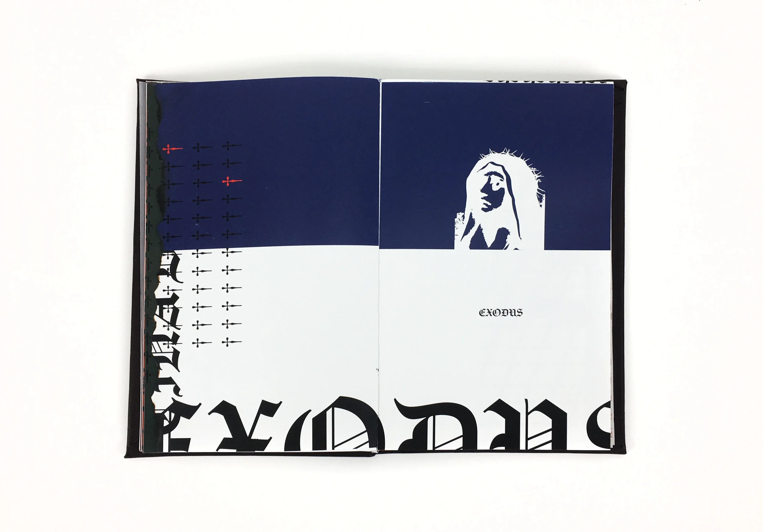
Confessions of Contrition is a publication that discusses the damaging effects the Catholic church can have on individuals through an anthology of interviews, confessions, testimonies, and revelations. I interviewed three people: two who grew up in the Catholic church, but had radically different backgrounds, and my mother, who did not grow up Catholic, but had decided to raise me Catholic. I included my own writing, poems, scriptures, and song lyrics as well. I hope it can teach something, give some sort of solace, bring new insights, and be a refreshing outlook on the church itself. This is simply to bring awareness to the damaging effects that it can have on those who have been forced into the religion and have never really identified with it.
When I was putting this project together, I collected all sorts of memorabilia from my Catholic school days— Bibles, prayer cards, rosaries, etc. for stylistic inspiration. I was also really inspired by the exhibition of medieval art in the Nelson Atkins museum in Kansas City; they had stained glass pieces, illuminated manuscripts, and even reliquaries on display. Since I wanted to target the demographic that normally would not read a book criticizing the Church, I thought it would be prudent to house the criticisms in a book that looked familiar to the canon of holy documents. I also just really love the beauty of the illuminated manuscripts and wanted to emulate that throughout. Since this was to be on display, I thought it would be interesting for it come in its own special box that’s reminiscent of a confessional and would force people to want to interact with it. I hand-bound this 15” x 9” book by using perfect binding glue, stretching leather over the cover board, and hand-stamping the title on the leather. I used a digital laser cutter for the confessional pattern (which is also a pattern used throughout the book) and made the box myself. I wanted this book to be something you couldn’t ignore by making it so large with a rather unorthodox presentation.
OLD TESTAMENT STYLE
Since I wanted the book to imitate illuminated manuscripts, I then decided to organize the chapters and sections of the book mimicking the Bible’s structure. The Old Testament is the parts of my own writing and interviews that deals with the grapplings and less than ideal experiences we’ve had with the Church. With so much uncertainty, confusion, and frankly, fear, surrounding these memories, I decided the stylization should reflect that. Thus, the harsher imagery, graphics, and typography. My main design goal/challenge with this book was to show emotion through typography with little to no imagery. So, I carefully chose the typefaces to reflect that goal and assigned a darker and more morose color palette (with a pop of jarring bright red) throughout this section. Each person that I interviewed was allocated their own color to show who what saying what, and they each had their own unique pattern comprising of typographic daggers that closely resemble crosses. I also burned the edges of every other page to further drive the point home and chose a paper with a rougher texture for this section.
NEW TESTAMENT STYLE
This style is more free and open, with happier colors to reflect everyone coming to terms with their experiences in the church. It takes elements from the church iconography and making it something new— which represents everyone not dismissing the church, but taking elements from it to make something better.


