Phish Riviera Maya 2026
⋆˙ ੈ✩‧₊˚.⋆☾⋆⁺₊✧‧₊˚✩ ੈ⋆˙
Creative + Art Direction: Sarah Dean Morales / Julia Mordaunt
Design + Illustrations: Sarah Dean Morales
I had the wonderful chance to brand Phish’s run of shows in Cancun, Mexico at the Riviera Maya. Julia Mordaunt, Phish’s creative director, approached me with a concept to make a postcard-esque style with unique typography. I pulled images from all around the Yucatan peninsula — from the flora to the fauna. I wanted this to be a little surrealistic as well — that’s why there’s cacti in the water. Julia and her team then built out the website from my initial graphic and I’m so stoked on how it looks!!!
Home page of phisrivieramaya.com
The Band Light
⋆˙ ੈ✩‧₊˚.⋆☾⋆⁺₊✧‧₊˚✩ ੈ⋆˙
Creative + Art Direction: Sarah Dean Morales
The Band Light is a Nashville-based band steeped in classic rock influences with both their image and the sound. They wanted a logo to reflect those attributes, so I used the classic “Avant Garde” font for the main lockup, as well as ‘70s colors to evoke the nostalgia of the decade, but keep it fresh. Playing with the name of the band, I used a shadow to capture “light” in a visual form, as well as using star shapes and the “light beam” stripes that carry through their brand.
Homepage of their website
The logo being used on album art as well
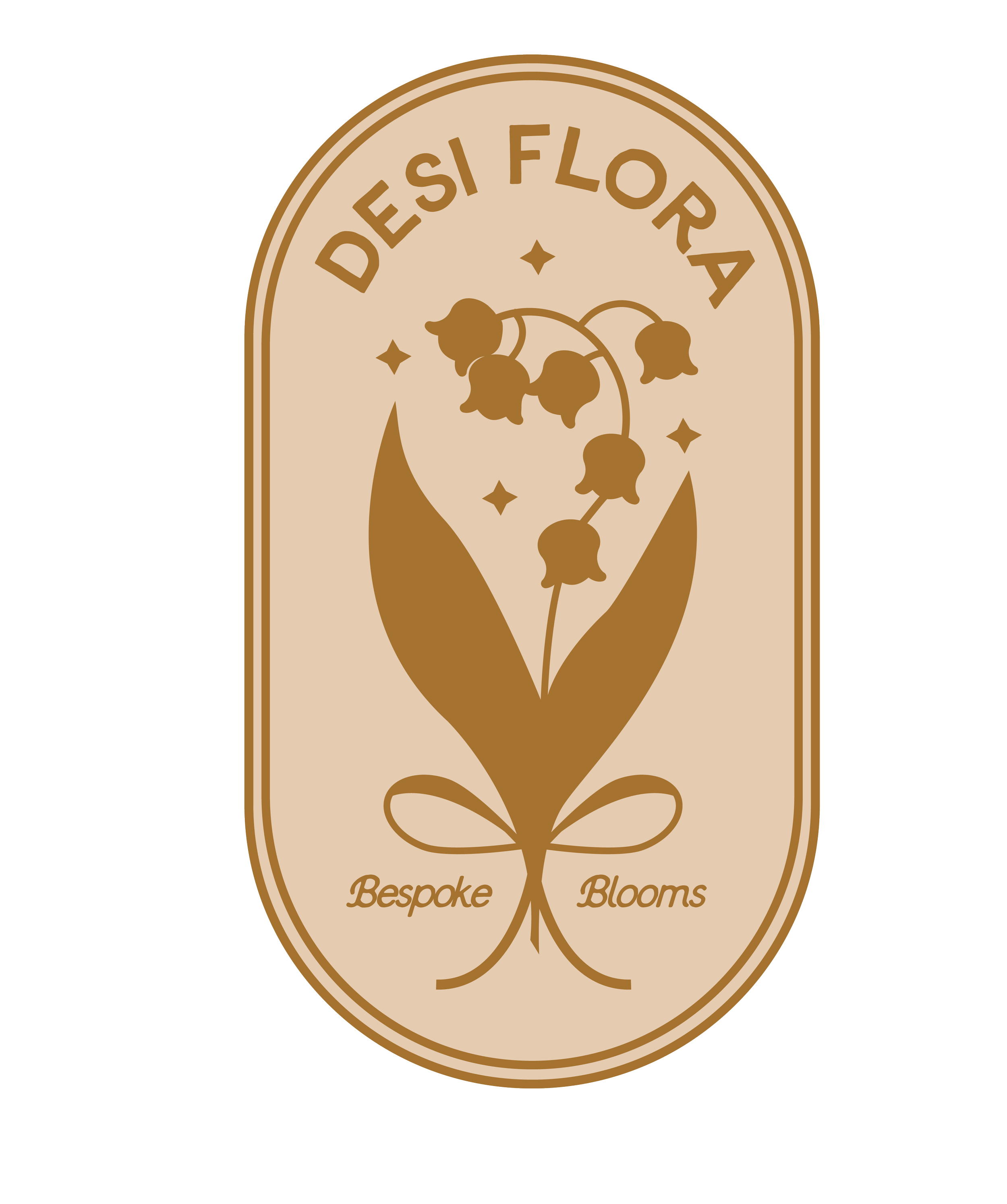
Desi Flora is a floral design studio is a based in Kansas City. Desi Flora Design encapsulates the essence of floral beauty through culturally inspired motifs and vibrant colors, creating bespoke floral arrangements and decor that celebrate tradition with a modern touch.
I wanted the logo to reflect those attributes — by combining elements of a traditional logo with a pill shape and a modern rendering of a lily of the valley: Desi’s favorite flower.
Leawood Fine Art Gallery
⋆˙ ੈ✩‧₊˚.⋆☾⋆⁺₊✧‧₊˚✩ ੈ⋆˙
Leawood Fine Art Gallery is an art gallery located in Leawood, Kansas. It features a diverse collection of artworks from both local and international artists. The gallery showcases various forms of visual art, including paintings, sculptures, and mixed media pieces. It is known for its curated exhibitions and events, offering a space for art enthusiasts to appreciate and purchase unique artworks. The gallery aims to promote contemporary art and provide a platform for artists to display their creativity.
Leawood Fine Art's logo features a sophisticated and elegant design, reflecting the gallery's commitment to high-quality art and professionalism. The logo often includes a stylized representation of a frame — which speaks both to the art and framing sides of the business. The overall design aims to convey a sense of creativity, refinement, and artistic excellence.
Pleaser Magazine
⋆˙ ੈ✩‧₊˚.⋆☾⋆⁺₊✧‧₊˚✩ ੈ⋆˙
Pleaser is an independent, women-run online and print music magazine that serves as a breath of fresh air in the overly critical music journalism landscape. We aim to highlight our favorite artists, their managers, tour managers, photographers, and all other behind the scenes players that make the music world go ‘round. We are run by fans, made for other fans and music industry professionals like us. We are extremely passionate about making space for our community of mostly women and non-men in the male-dominated music industry. We are committed to being a source of encouragement and inspiration for everyone.
This logo had to be simple and easily recognizable as it serves as a masthead first and foremost. The logo type is King’s Sans, which has a classic feel, but with a few quirks that speak to the Pleaser colloquial, but journalistic brand voice. The logo image is a loose interpretation of a vinyl record, but also sound waves emitting; we’re getting our stories to be heard far and wide.
Read more of my thoughts about the individual issues of Pleaser here.


